
Router explorer reloaded
A complete redesign of router protocol explorer using modern glassmorphism design, responsive components, simplified UI/UX for better understanding of the user and a lot of colors.
Created on 27th August 2022
•
Router explorer reloaded
A complete redesign of router protocol explorer using modern glassmorphism design, responsive components, simplified UI/UX for better understanding of the user and a lot of colors.

The problem Router explorer reloaded solves
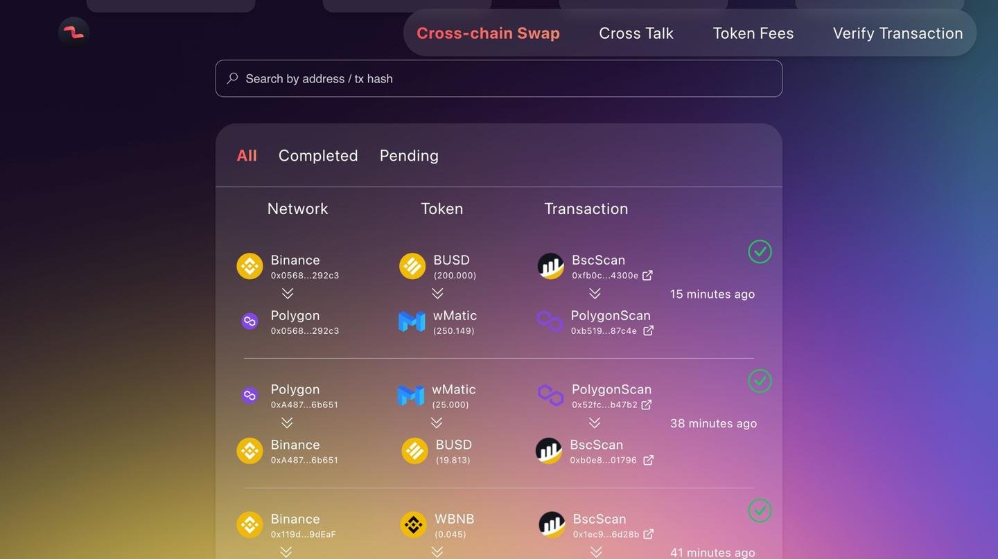
- Personally as a user I feel the current explorer is a bit outdated when it comes to user experience. For example the whole content is arranged in a traditional table like manner, which is usually not a good experience.
- And the pagination also feels a bit unnecessary. There are way too many token images in the table which makes it very hard to understand what exactly is going on, one has to actually research a bit to understand it.
- So I have tried to simplify the UI/UX as much as possible given the available time with a modern design.
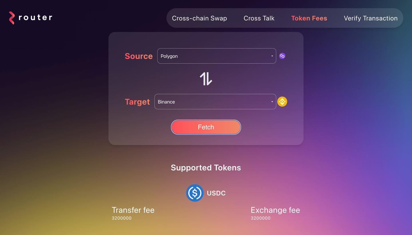
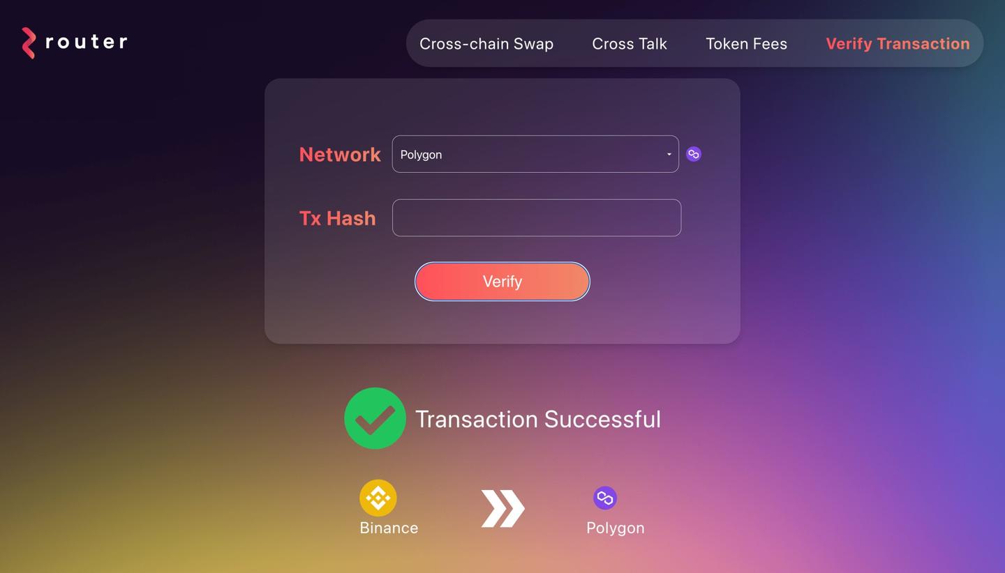
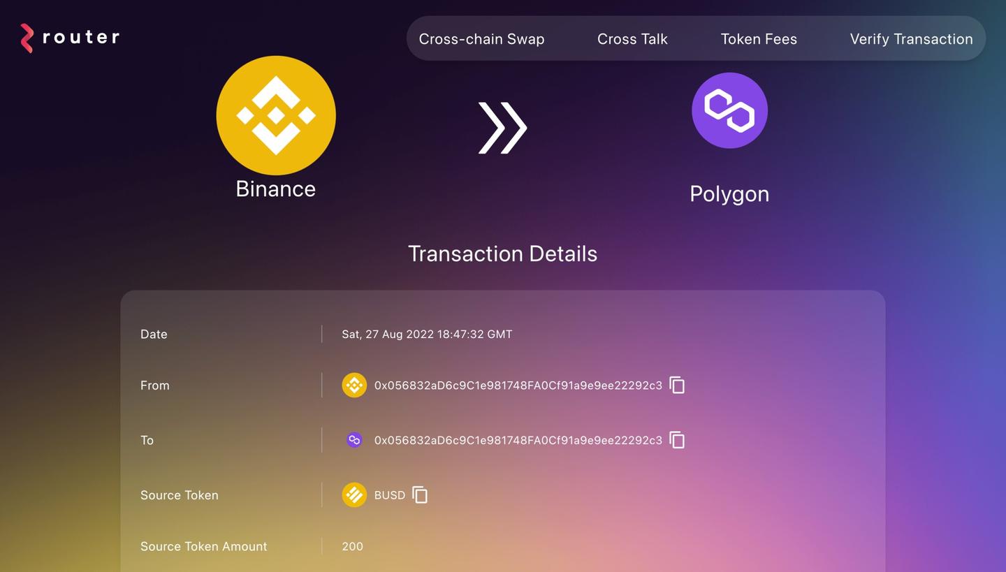
- I have arranged the transaction data in a arrow flow manner which makes it very less intimidating and easy to understand. 5. There are two new features added in the explorer to check the fee for various tokens and verifying the status of a particular transaction.
Challenges I ran into
- Trying to figure out how to fetch all the token data and save it in one place for later use took a bit of time.
- Understanding the various field coming in the apis and how they should be rendered in the UI.
- Trying to come up with a simple and not so intimidating design for the transaction table.
- CSS issues with the charts trying to get the correct dimension.
Technologies used
Cheer Project
Cheering for a project means supporting a project you like with as little as 0.0025 ETH. Right now, you can Cheer using ETH on Arbitrum, Optimism and Base.
Discussion
Builders also viewed
See more projects on Devfolio