Designing a better UX for hackathons.
For the last 8 months our team has been trying to gather all the insights from the experience of hosting hackathons and trying to turn it into a product. This article is a throwback to the design journey so far.

Part 1: Applications
For the last 8 months our team has been trying to gather all the insights from the experience of hosting hackathons and trying to turn it into a product. A product that makes applying to hackathons, organizing hackathons, reviewing and filtering hackers, discovering talent and everything else involved, easier.
This article is a throwback to the design journey so far. What we are trying to solve and how we are doing it.
Organizing and running a successful hackathon has many moving parts and variables. Each of them needs to work just right for a hackathon to successfully happen. For the past 3 years our team has been organizing InOut, India’s largest community hackathon and this month we wrapped up ETHIndia, which was the first hackathon hosted on Devfolio. With such expanse of experience, I believe we’re the right people to build something like Devfolio.
There were many iterations as the idea solidified but that’s a story for another day, for right now let’s begin with the case study.
The first question that set us on the path to building Devfolio was this.
How can we make applying to hackathons easier?
How can we make applying to hackathons easier?
Answer: Kill the application
It can be difficult to relate to this one if you’re not a regular hackathon goer, but hang on. You see, each hackathon you wish to attend has a separate application procedure. For every single hackathon you wish to attend you have to fill in a ton of fields before you can finally hit apply and wait for the result.
It’s an overkill, to fill the same information over and over for each hackathon you apply to. And if you have built a new project or started work on something exciting after you have submitted an application to a hackathon, there is no way you can go back and edit or update it.
The solution, kill the application, the whole concept of it. Instead, on Devfolio you maintain a profile that you can keep updated.

Each time you wish to apply to a hackathon, clicking on “Apply” doesn’t take you to a huge application wizard with a slew of fields. What it does instead is simple to understand. It’s a total of 3 steps.
1)You find a hackathon you wish to attend and click apply 2)review your profile and then 3)submit your profile to the hackathon giving the organizers permission to analyse and review your profile helping them in deciding whether to invite you to attend the hackathon or not. And in case the hackathon doesn’t have a review phase, just clicking on apply does the trick.
The idea of having a profile and giving permission and killing the application, at this point, might still be vague in your head. But not for long, I’ll take you, step by step how this part of Devfolio works. At places I’ll also shed light on why some of the UX decisions were made.
Let’s Begin!
What is this “Devfolio” thingy?
Consider a scenario where you’re unaware that Devfolio exists, since we’re new it’s likely that will be the case for most of our users. You find a hackathon you wish to be a part of. You visit the hakcathon’s webpage and click on apply, or, better! You click on “Apply with Devfolio” ;-).

Once you do that, you’re greeted with a modal with three fields that are required to sign you up for our platform.
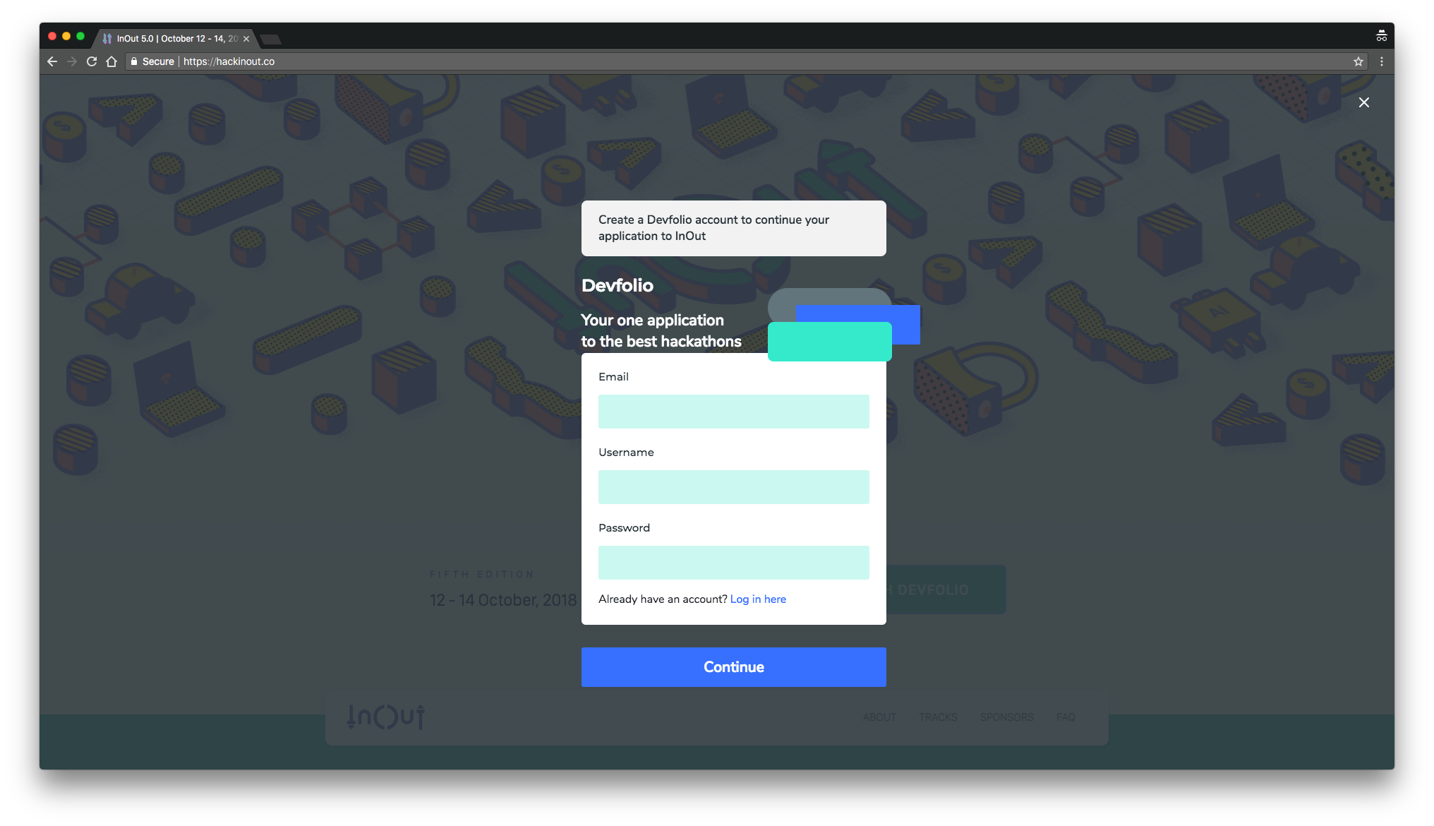
You fill in the fields and click the CTA that’s glaring at your face and that’s it, you’re in!
It’s important to understand here that even though we have tried to create an exhaustive list of fields for hackers to fill and which — from our experience — we think should be enough for any hackathon to filter and perform analytics, there is always some very specific data that a hackathon needs. Something so specific that it cannot be made part of the general collection of fields.
Therefore, before Devfolio sends you on to your dashboard, it needs to collect the specific information required to apply to that particular hackathon.
For example, the hackathon InOut needs to know if the hackathon is going to be your first, if you will be hacking on hardware and the tracks that you plan to hack on. This type of data is very specific to a hackathon and cannot fit in a general data set that every hackathon needs.
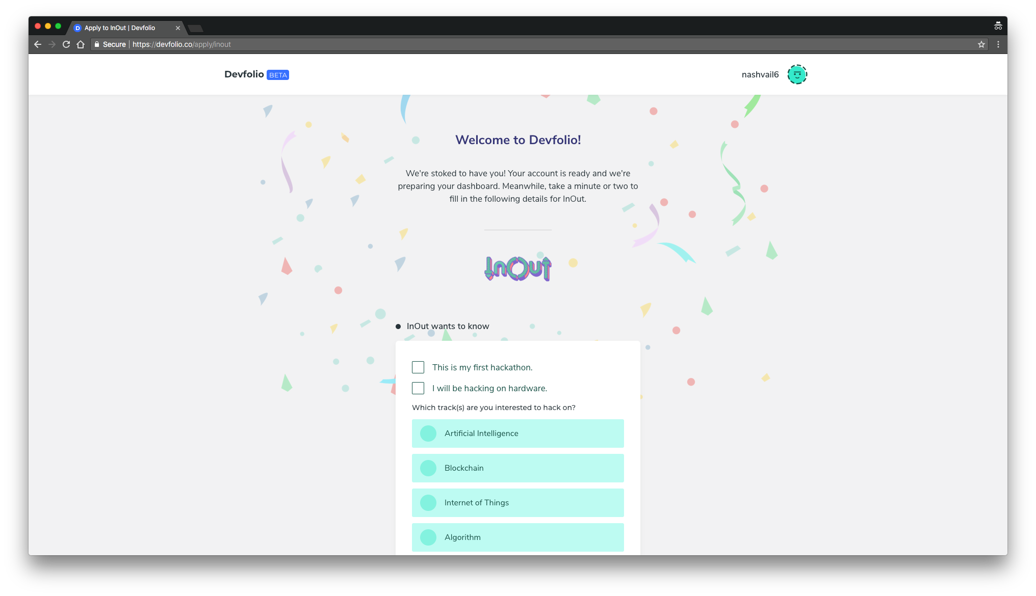

UX: Notice that you’re asked to verify your email at the very end, there’s logic behind that. Once you have invested time, even if not much, in filling fields you’re more likely to verify your email because you’re already in the process.
The extra information hackathons need is rarely anything that’ll take the applicant more than 60 seconds to fill in. Once done, the next click takes you straight into your Devfolio dashboard.

That’s the Devfolio dashboard in all it’s glory, or, just a part of its glory. There’s a lot more to explore. But here, you’re in and you have applied to the hackathon without any friction and you have spent less than a minute in the process.
What are you going to do with all this time man? Crazy!
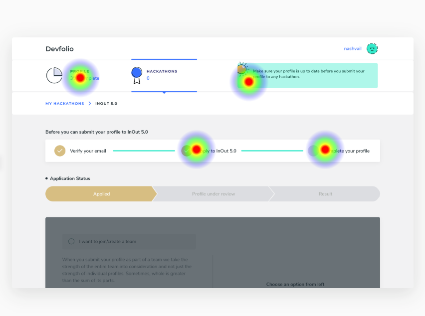
The next thing to do is to submit your profile to the hackathon for review. But before you can do that you need to complete your profile first, obviously.

UX: The decision to show the above UI component is again based on “I have done this much, what’s one more”, or scientifically speaking, The Endowed Progress Effect, a phenomenon that increases motivation as people believe they are nearing a goal.
And “Complete your profile” is a link because we had a lot of users clicking it in our tests. ¯\_(ツ)_/¯
Moving on.
Completing your Devfolio profile does require you to fill in a couple of fields. But it’s a one time process. Fields have been divided into intuitive sections, with each section requiring less than a minute to complete.
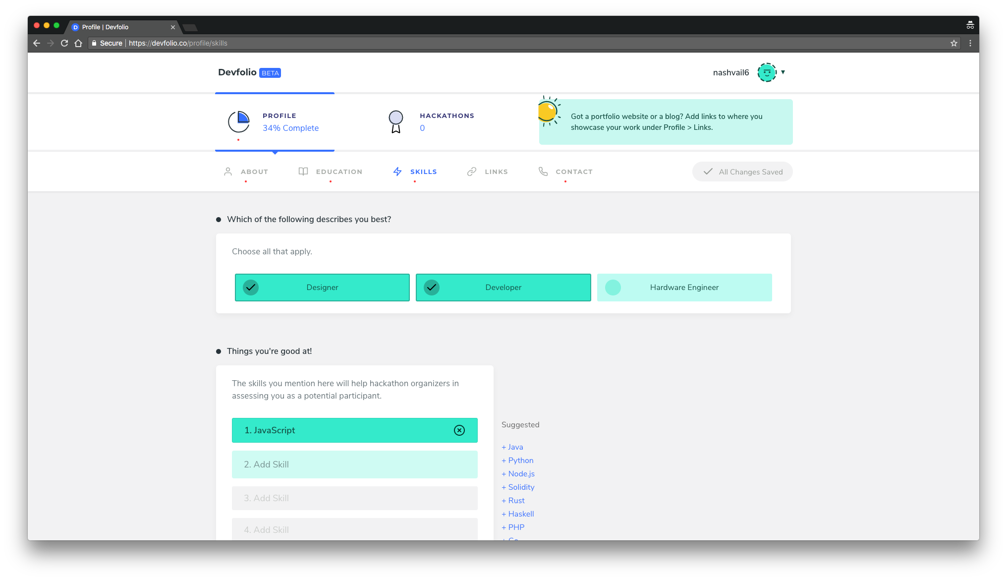
Once you have completed your profile, you return back to your hackathons to find a list of hackathons and a very bold indicator indicating the hackathons to which you haven’t submitted your profile for review yet.

Whaaattt?? no, I want to submit my profile for review.
Calm down.
It just takes a click. Click on the hackathon you were about to submit your profile to and there! since your profile is a 100% complete, the component that allows you to submit your profile for review becomes active.

Now here, you can either choose to submit your individual profile for review or become part of a team and then submit the team for review.
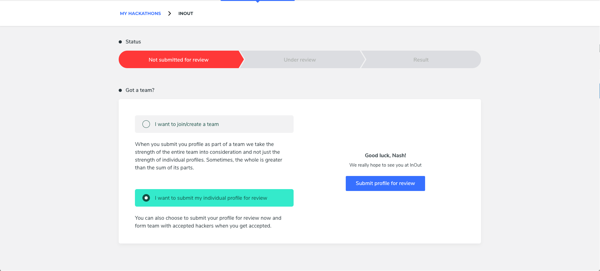

When an entire team is submitted, the team is treated as one. Therefore, if there’s someone relatively new to engineering and building stuff they can form a team with someone experienced and still stand a good chance of getting accepted to a hackathon. Because sometimes, the whole can be greater than the sum of its parts.
This is where a portion of Devfolio ends. There’s more to this flow, what happens after you get accepted? how does the dashboard function when a hackathon is under progress? All of that is a story for the next part.
Now that you already have a profile on Devfolio, think for a second, how easy it is going to be to apply to your next hackathon. Just click apply, see if your profile is up to date, submit your profile for review. That’s it! Done! In less than a minute. That is what we were after, making the application process easy and I think it’s been nailed, 90%, because there is always room for improvement and chairs are always empty for new ideas to rush in.
This flow was a UX challenge for me, it took time and iterations to arrive at something that is being used by hundreds daily without falling off the path. Watching people use something you designed and especially use how you intended it to be used is at par with the other top pleasures in life.
This flow, the solution wasn’t done in one single shot. It took iterations and testing. Below I’d like to go over some of the ugly parts, what was assumed wrong, designed wrong and how it was improved.
Lessons learnt
Be Honest to Your Users
One idea of a flow for applying to a hackathon that sounded great but failed when built was to disguise the filling of profile as an application to a hackathon.
The way this flow was structured is, again, consider you’re brand new to Devfolio, you click apply at some hackathon’s landing page and so the flow begins.


You go through verifying your email, verifying your phone number and then filling each section one by one to finally be able to apply to a hackathon. This flow looks like you’re filling an application but you’re actually filling in your Devfolio profile. This sounded like a genius idea but to our users it just felt like any other application to a hackathon and not a platform where they can maintain a profile. This defeated the whole idea and I had to get back to the drawing board.
One another flaw with this flow was that once you had completed your profile you needed to submit it to the hackathon for review. Seeing a screen with a red alert after putting in so much work was a bummer for almost everyone who tested and used the platform.

I also tried charting a user journey/mood graph as they would go through this flow when applying to a hackathon.

The mood keeps declining.
Something was definitely off. I’m glad we moved away from this flow and to something better, less confusing and more gratifying.
Sidenote: If you’re curious about what’s the basis behind the metrics used in the mood graph, we can always discuss that on Twitter.
Lessons learnt, let the users into your app as early as possible, make them feel they have accomplished a task, celebrate it. With the new flow our user is in their dashboard in two clicks, unlike this discarded flow which took tens of clicks and a couple of hundreds of keystrokes. And moreover, it’s more honest, you are completing your profile by completing your profile and not by completing a long application.
Always Test
The “bad” flow you just witnessed wasn’t user tested, we just sent it live assuming the decisions I took and the user behaviour I assumed were a 100% correct. I was wrong, the next flow was properly tested and redone whenever we observed an issue. A great thanks to the InOut community for participating in our user tests, we love you all ❤
Long story short, always test.
Users will click anything that’s blue
Don’t make headings blue, NASH, users will try to click it.
Learnings from User Testing:
— Nash Vail (@NashVail) June 25, 2018
1. People will try to click anything that's blue
There’s much more ground to cover, we’re working on some challenging UX problems and building products that’ll not only make applying to hackathons easier, but also organizing, reviewing candidates, discovering talent, managing huge volumes of data, predicting developers’ interest and much more, a lot easier. We’re very excited to see what lies ahead for Devfolio.
We have a ton of new things in progress and are looking for front-end engineers (React + Redux) to join our team. If you’re up for it, hit me up at [email protected].
Devfolio is versatile enough to handle both online and offline hackathons. If you’re a company or a community wanting to organize one, reach out to us at [email protected] we’ll be so happy to collaborate with you.
The platform is still young and in beta, this has been the biggest project for everyone involved in building it. Hope you enjoyed reading the article. There’s a lot more to come. Seen you in the next one :)
Originally published at https://medium.com/devfolio on August 31, 2018.
